Complementary Colors in Art: Turning Contrast into Emotion

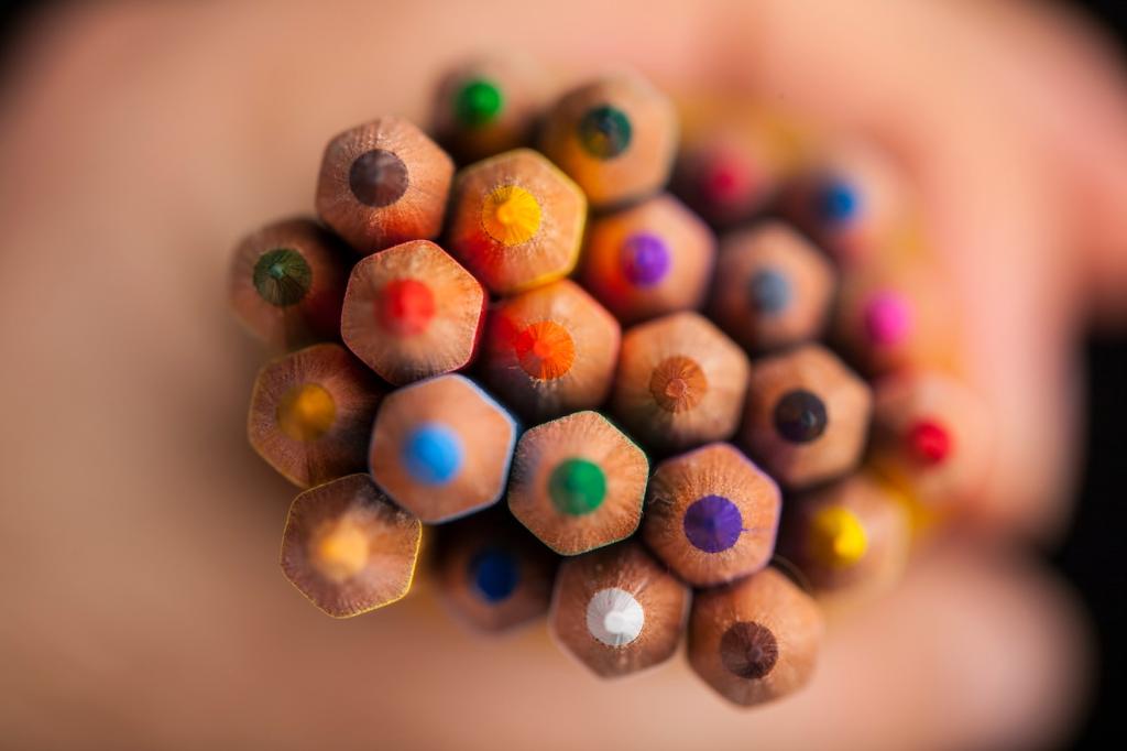
Chosen theme: Complementary Colors in Art. Explore how opposite hues ignite energy, shape mood, and guide the eye. Learn practical methods, inspiring stories, and playful exercises. Share your experiments and subscribe for fresh color challenges every week.

Opposites on the Wheel: Why Complementary Colors Spark

Place red beside green, blue against orange, or yellow opposite violet, and watch edges vibrate. The eye’s adaptation amplifies contrast, making each color feel brighter and more alive. Use this phenomenon to direct attention with confident, intentional emphasis.

Opposites on the Wheel: Why Complementary Colors Spark

Opponent-process theory explains why red–green and blue–yellow pairs feel electric. Stare at a color, then look away, and you’ll see its complement as an afterimage. Designers and painters exploit this built-in physiology to create clarity, depth, and emotional resonance.

Brush, Pigment, and Complementary Strategy

Try a green underpainting beneath warm reds in a portrait. The subtle show-through energizes midtones and keeps saturation honest. I once rescued a muddy scene this way; the green foundation gave brick walls a believable, sunlit pulse.

Brush, Pigment, and Complementary Strategy

Blend complements to create chromatic grays, then nudge warmer or cooler. That neutral control prevents garish clashes. Start with blue–orange for skies and architecture; add tiny, deliberate shifts until your accents sparkle without overwhelming the composition’s overall balance.

Complementary Colors in Photography and Film

Dress a subject in rust orange against a teal door and the eyes will lock in. Complementary contrast isolates the figure cleanly. Keep one element dominant and the other supportive, so storytelling remains crisp, flattering, and emotionally consistent throughout the frame.

Complementary Colors in Photography and Film

Skin sits naturally in warm ranges, so pushing shadows toward teal creates separation without plastic gloss. Watch your mids; over-leaning teal collapses nuance. Share your favorite teal–orange grading recipe below, and subscribe for a printable checklist of subtle, cinematic adjustments.

Design and Branding with Complementaries

Contrast with Care and Accessibility

Complementary high contrast can help readability, but value contrast matters more. Test WCAG ratios, tweak lightness in HSL, and verify hover states. A vivid button on a muted complementary background can invite clicks without straining the eyes or screen.

Accents That Steer the Journey

Use the complement as a precise accent: call-to-action buttons, notification badges, chart highlights. Keep the base palette quiet, then let tiny complementary sparks direct scanning. Ask users to comment where their eyes landed first, and iterate on honest feedback.

A Small Bakery’s Teal–Apricot Refresh

We helped a bakery swap tired brown packaging for teal boxes with apricot ribbons. The complementary pairing felt fresh, warm, and memorable. Foot traffic rose after customers posted photos; small, shareable contrasts can become word-of-mouth marketing magnets overnight.

Hands-On Complementary Exercises

Pick one pair per day: red–green, blue–orange, yellow–violet. Paint or design a tiny study using 80% neutrals, 15% dominant hue, 5% complement. Post results daily, tag our handle, and subscribe for critique highlights and constructive notes.

Hands-On Complementary Exercises

Arrange colored paper and household objects into complementary setups. Photograph under a single lamp, then again with window light. Compare edge quality and saturation. Share your favorite lighting configuration, and we’ll compile reader tips into a community field guide.

Avoiding Complementary Overkill

Convert your piece to grayscale. If the structure reads without color, complements will enhance rather than rescue. Adjust light–dark relationships first, then place the complementary punch exactly where the story needs emphasis and clarity.

Avoiding Complementary Overkill

Chromatic grays—mixed from complements—support bold accents like stagehands backstage. Use them to glue shapes together and pace the eye. Readers report fewer muddy passages after practicing neutral control for a week; try it and share your findings.
Dwaylunkad
Privacy Overview

This website uses cookies so that we can provide you with the best user experience possible. Cookie information is stored in your browser and performs functions such as recognising you when you return to our website and helping our team to understand which sections of the website you find most interesting and useful.