Analogous Colors: Creating Harmony

Welcome! Today’s chosen theme: Analogous Colors: Creating Harmony. We’ll explore how neighboring hues on the color wheel calm, guide, and delight, whether you’re designing a room, a brand, a wardrobe, or a photograph. Join the conversation, share your palettes, and subscribe for weekly color stories and hands-on exercises.

Understanding Analogous Colors on the Wheel

Where Harmony Lives on the Wheel

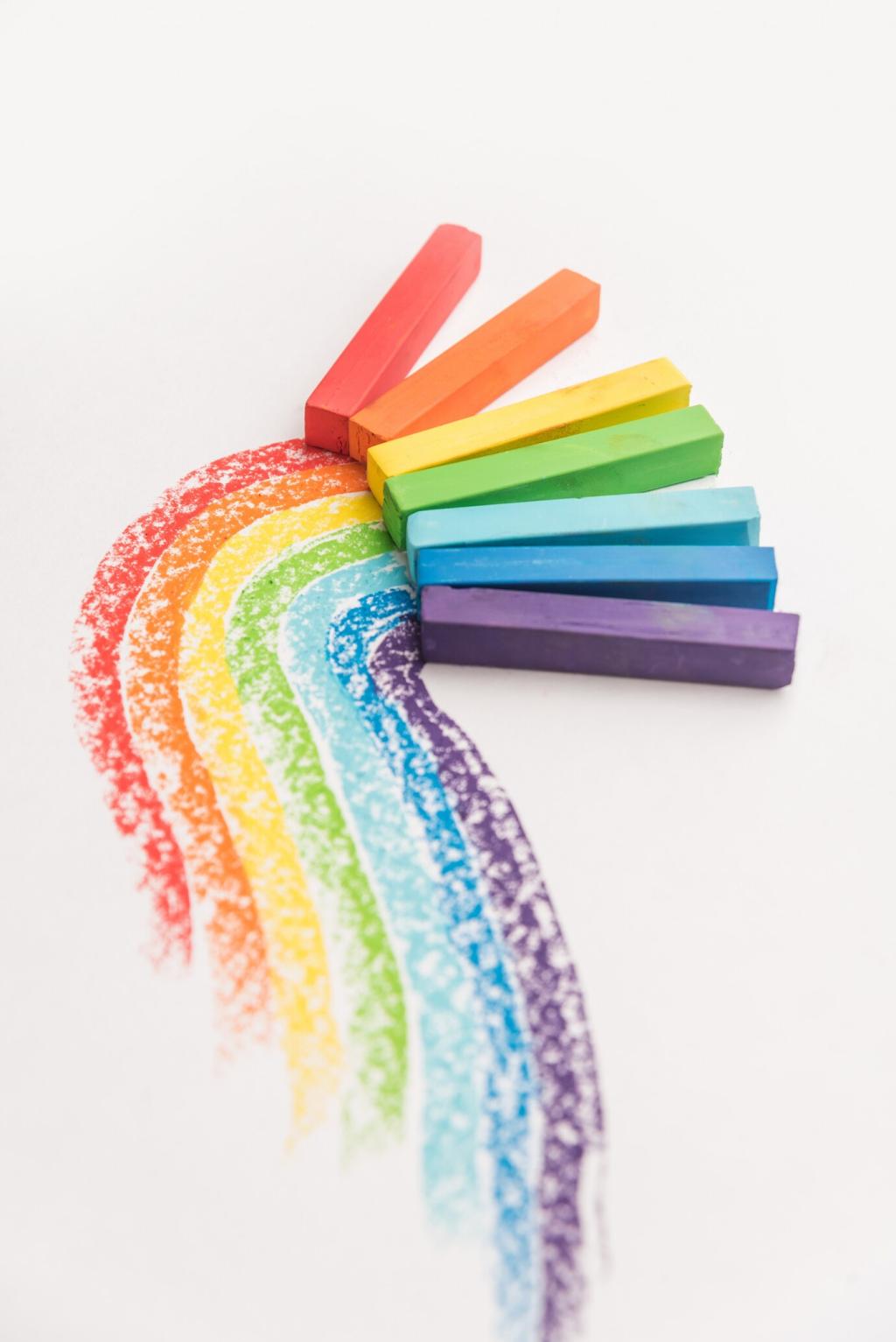
Analogous colors sit side by side on the color wheel—often spanning two to four neighboring hues. This proximity creates natural harmony, because the hues share undertones. Think blue, blue‑green, and green, flowing gently like notes in a chord.

The Arc: 30–60 Degrees (Sometimes 90)

A practical guideline is to select an arc of about 30–60 degrees on the wheel; some projects comfortably expand to 90. The tighter the arc, the calmer the mood. Widen it slightly when you need more variety without losing that cohesive, analog vibe.

A Small Studio Anecdote

A freelancer I know painted her tiny workspace with a blue‑teal‑green scheme. The room felt larger, and her clients noticed calmer conversations. She said the analogous palette softened decision fatigue, turning meetings into focused, friendly sessions.

Building a Cohesive Analogous Palette

Pick an anchor hue for dominance, a bridge hue to connect, and a subtle accent to spark interest. Example: anchor with deep blue, bridge with teal, accent with fresh green. Each hue has a job, so the composition feels intentional and balanced.

Building a Cohesive Analogous Palette

Keep harmony by shifting value and saturation rather than jumping across the wheel. Lighten the anchor for backgrounds, deepen the bridge for depth, and reserve brighter accent notes for emphasis. Nudge warmth or coolness carefully to maintain unity.

Building a Cohesive Analogous Palette

Colors behave differently on walls, screens, textiles, and paper. Print swatches, view them under daylight and warm bulbs, and screenshot interfaces on multiple devices. Keep notes on when your analogous palette whispers, sings, or gets muddied.

Building a Cohesive Analogous Palette

Lorem ipsum dolor sit amet, consectetur adipiscing elit. Ut elit tellus, luctus nec ullamcorper mattis, pulvinar dapibus leo.

Analogous Harmony in Interior Design

For bedrooms and reading nooks, a blue‑teal‑green range feels like a deep breath. Let blue anchor walls, introduce teal textiles for movement, and sprinkle leafy green plants. The palette mirrors nature, encouraging rest while keeping the space inviting.

Analogous Harmony in Interior Design

In kitchens or dining areas, red through orange fuels appetite and conversation. Keep saturation moderate on large surfaces, then add a lively orange bowl or vermilion poster. The analogous warmth glows without shouting, keeping gatherings comfortable.

Branding and UX: Calm Flow, Clear Focus

A blue‑teal‑green system can gently guide users through onboarding, with each step a neighboring hue. Subtle shifts signal progress without abrupt jumps. The result: reduced cognitive load, fewer drop‑offs, and a brand voice that feels thoughtful and steady.

Branding and UX: Calm Flow, Clear Focus

Analogous harmony still needs readable contrasts. Use value and saturation differences for text and controls, aiming for strong contrast ratios on critical elements. Borders, shadows, and neutral tints provide clarity without breaking the analogous mood.
Golden Hour Triad
A yellow‑gold‑amber run suits sunrise sequences. Skin tones glow while backgrounds stay coherent. Use a slightly deeper amber for shadows, keeping mids gentle. The consistent family knits frames together, so the story breathes rather than stutters.
Blue–Cyan–Teal Moods
For reflective or maritime scenes, lean into blue, cyan, and teal. Lift cyan in highlights, keep blue in shadows, and reserve saturated teal for key props. The audience senses continuity, like a tide pulling them through the narrative.
Neutral Breaks as Punctuation
Introduce grays or soft off‑whites as visual commas. These neutral pauses let your analogous color passages land with intention. When everything is harmonious, a moment of quiet negative space helps viewers notice the exact emotion you crafted.

Art History: Masters of Neighboring Hues

Monet layered blue, violet, and blue‑green in luminous veils. The analogous drift mirrors water’s surface, where subtle changes say more than bold clashes. Study his edges: soft transitions hold attention longer than stark outlines ever could.

Tools, Workflows, and Community

Use HSB/HSL sliders and wheel tools like Adobe Color or Coolors to plot neighboring arcs. Lock your anchor hue, then nudge around it to collect bridge and accent tones. Save versions for light, medium, and dark contexts to stay consistent.

Tools, Workflows, and Community

Keep a small notebook of printed or painted swatches labeled with hex, CMYK, or pigment names. Add notes on lighting, paper, and mood words. Over time, this becomes your personal library of analogous harmonies you can trust under pressure.
Dwaylunkad
Privacy Overview

This website uses cookies so that we can provide you with the best user experience possible. Cookie information is stored in your browser and performs functions such as recognising you when you return to our website and helping our team to understand which sections of the website you find most interesting and useful.